last modified: Tuesday, 26-May-2009 03:44:40 CEST
Document status: complete
Ternary Diagrams
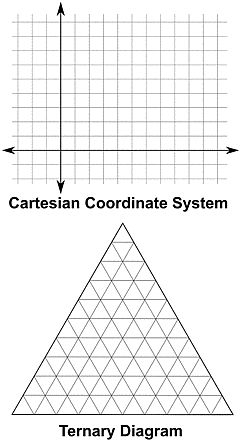
Fig.1.1
|
Except for the obvious difference in shape, there are three important differences:
Ternary diagrams are often used to visualize the composition of rocks or minerals, because the percentual values are dependent variables: the "dependence" between the components is the fact that they must add up to 100%, so if we have a rock made of 2 minerals A and B, and we know the value of one variable (for example, 20% of mineral A), we can calculate the other (100% - 20% = 80% of mineral B).
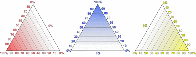
Fig.1.2
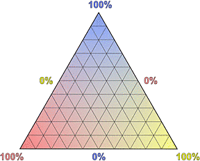
Fig.1.3
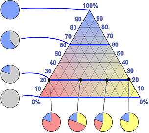
Fig.1.4
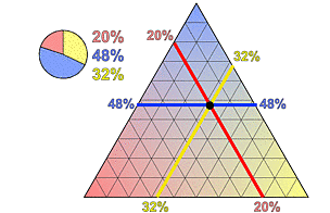
Fig.1.5
|
Figure 1.3 shows the final ternary diagram, the combination of the three triangles from Fig.1.2. Note that now each edge of the triangle represents 2 axes with opposite directions for 2 components, going from 0% to 100% for one component and from 100% to 0% for the other. Because it would simply look confusing, the complete annotation of the axes is usually not shown.
Figure 1.4 explains how the diagram is read. To the left we see four pie charts showing different contents of the "blue component". A content of 100% corresponds to the top corner, but a lower content, like 0%, 20% or 60%, is always represented by a line in the triangle.
The relative concentrations of the other components (red and yellow) change along these lines, as shown for 4 positions along the 20%-line. The corresponding pie charts with all components are shown at the bottom.
Finally, Fig.1.5 demonstrates how to plot the composition of a rock into a ternary diagram. The position is simply the intersection of the lines that correspond to the 3 percentual values.
 Printer Friendly Version
Copyright © 2005-2013, A.C. A k h a v a n
Impressum - Source: http://www.quartzpage.de/app_td.html